Brand · Living document
The Work+Shelter Brand
How we look, sound, and feel — and how to build with us. This page is generated from our live design system: the colors below reflect the current palette in our CMS, and every type and component sample renders with the real production styles.
Last updated July 4, 2026
01Identity
Logo & wordmark
The Work+Shelter wordmark on its three approved backdrops. Keep clear space of at least the cap-height around it; never render below 120px wide on screen.
Wordmark (SVG) White wordmark (SVG)On white & cream, use the default mark. On dark, use the white mark.
02Palette
Color
The live brand palette. Click any swatch to copy its hex. Contrast badges show WCAG grade as text on white and on ink. Edit these in CMS → Settings → Color Palette.
Coral
coralPrimary brand accent (mauve). CTAs, highlights, links — used sparingly, never decorative.
AA Large 4.1on whiteAA 4.8on ink
White
whiteClean white for airy page sections and product shots.
Fail 1.0on whiteAAA 19.5on ink
Cream
creamWarm off-white for editorial sections and hero intros — softer than pure white.
Fail 1.1on whiteAAA 18.4on ink
Seashell
seashellVery light warm tint. A near-white text color over deep brand surfaces, or the lightest background wash.
Fail 1.1on whiteAAA 17.8on ink
Black
blackTrue black. Use sparingly — prefer Charcoal for most dark surfaces.
AAA 21.0on whiteFail 1.1on ink
Light Gray
light-grayCool light gray for non-warm neutral backgrounds and dividers.
Fail 1.1on whiteAAA 17.7on ink
Charcoal
darkBrand charcoal. Primary dark surfaces, primary buttons, and dark-section backgrounds.
AAA 12.0on whiteFail 1.6on ink
03Type
Typography
Headlines set in Jost (display); body in Work Sans. The full token ladder below — each sample renders with the exact production class, shown in the chip beside it.
editorial.displayMega— Hero headlines onlyMade to Order
editorial.displayHero— Page heroesPurpose-Built
editorial.displayXL— Major section titlesEthical manufacturing
editorial.displayLg— Page titlesBrands making a difference
editorial.displayMd— Section titlesHow it works
editorial.displaySm— Subsection titlesSustainable swag
editorial.displayXs— Card group titlesCustom sewn goods
editorial.cardTitle— Card titlesOrganic canvas tote
editorial.bodyXL— Lead paragraphsWe partner with women artisans in India to make beautiful, made-to-order goods.
editorial.bodyLg— Intro copyWe partner with women artisans in India to make beautiful, made-to-order goods.
editorial.body— Standard bodyWe partner with women artisans in India to make beautiful, made-to-order goods.
editorial.bodySm— Captions, fine printProduced ethically in Delhi. Fair wages, dignified work.
editorial.eyebrow— Uppercase section labelsOur Work
editorial.label— Inline labelsFeatured
04Voice
Voice & tone
Warm. Approachable. Impact-driven. We let the work and the women speak — confident about outcomes, never hype-y.
We sound like
Warm and human — we talk about the women, the craft, the care.
We don’t
Corporate or sterile — no "synergies", no "solutions provider".
We sound like
Confident about impact — specific numbers, real outcomes.
We don’t
Vague virtue-signaling — no empty "we care about the planet".
We sound like
Plain and direct — short sentences, concrete nouns.
We don’t
Jargon-heavy or padded — no filler, no buzzwords.
We sound like
Quietly premium — the work speaks; we don’t oversell.
We don’t
Hype-y or salesy — no exclamation-point pile-ups.
05Surfaces
Backgrounds
Four canonical surfaces. Body copy uses the --ws-text-body variable so a CMS color override cascades everywhere.
White
Beautiful, made-to-order goods produced ethically by women artisans.
Cream
Beautiful, made-to-order goods produced ethically by women artisans.
Light gray
Beautiful, made-to-order goods produced ethically by women artisans.
Charcoal
Beautiful, made-to-order goods produced ethically by women artisans.
07Shape
Radii & elevation
The 4px radius grid plus the 13px brand radius (rounded-ws). Elevation runs elev-1 → elev-6; coral glows are reserved for primary CTAs.
Border radius
rounded-xs · 4px
rounded-sm · 6px
rounded · 8px
rounded-md · 10px
rounded-lg · 12px
rounded-ws · 13px
Brand radius
rounded-xl · 16px
rounded-2xl · 20px
rounded-3xl · 24px
Elevation & glow
elev-1
elev-2
elev-3
elev-4
elev-5
elev-6
coral-soft
coral-cta
08Rhythm
Spacing & containers
Section padding scales fluidly with the viewport (clamp). Three container widths frame the page.
Bar height = the vertical padding that token applies per side.
56rem / 896px
80rem / 1280px
96rem / 1536px
09Imagery
Photography & ratios
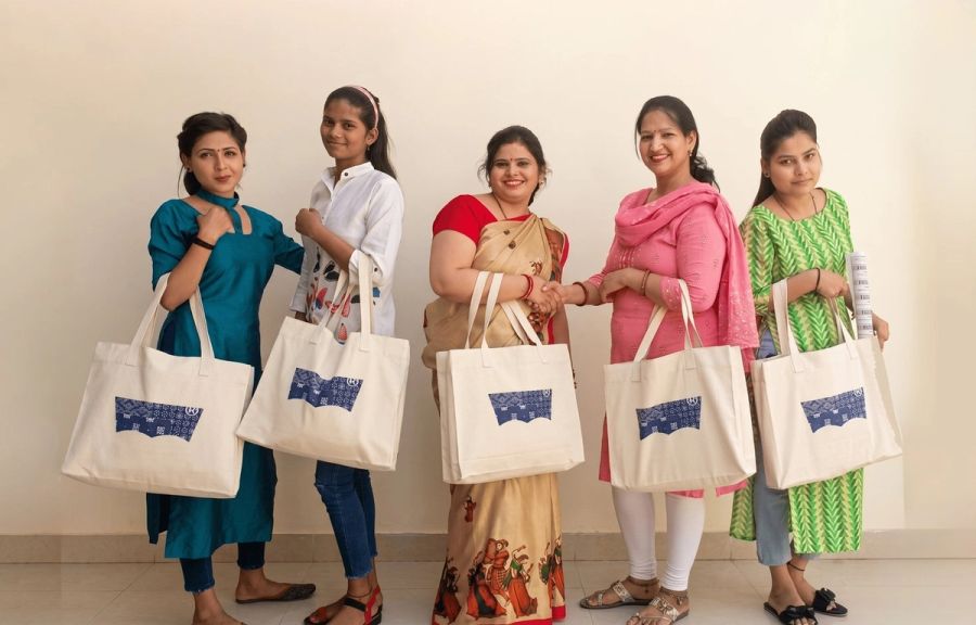
Real photos of the women, the workshop, and the goods — warm, natural light, no stock-photo gloss. Editors pick a crop ratio per image; the options:
Square (1:1)
Portrait (3:4)
Photo (4:3)
Landscape 3:2
Wide 16:9
Panorama 21:9
10Build with it
Component anatomy
A standard content card, assembled from the tokens above: eyebrow, title, body, and a CTA — all on the brand radius and elevation.
Featured Work
Custom totes for a launch
5,000 organic-canvas totes, screen-printed and hand-finished by our Delhi team — delivered in six weeks.
editorial.eyebrow — uppercase category label.
editorial.displaySm — card headline in Jost.
editorial.body — Work Sans copy via --ws-text-body.
<Card variant="default" hover="lift"> — rounded-ws + elevation + lift on hover.
<Button variant="coral"> — primary commerce CTA.
11Inclusive
Accessibility commitments
Non-negotiables baked into the system.
- Body text meets WCAG AA (4.5:1); we check every brand color against white and ink (see the swatches above).
- Touch targets are at least 44px tall (WCAG 2.5.5) — every Button size honors this, from sm (44px) up.
- Keyboard focus is always visible — a 2px coral focus ring with offset.
- Motion respects prefers-reduced-motion — entrance animations and the wordmark stagger disable cleanly.
- Headings carry their real text via aria-label even when animated word-by-word.
- Images require alt text; decorative images use empty alt deliberately.
12Guardrails
Do & don’t
Accent color
Use Coral (#b0649a) as the single accent — CTAs, highlights, links.
Introduce other accent colors (blue, teal, green) for emphasis.
Typography
Use the editorial.* tokens for every heading + body block.
Hardcode font sizes like text-4xl font-bold inline.
Border radius
Use rounded-ws (13px) on cards, buttons, inputs — the brand radius.
Mix arbitrary pixel radii (rounded-[Npx]) on primary surfaces.
Color in type tokens
Let color flow from the --ws-text-* CSS variables so overrides cascade.
Bake text-ws-neutral-500 into a shared typography token.
Dark sections
Use the documented dark surface (bg-ws-neutral-950) with white/70 body.
Invent one-off dark backgrounds with hand-tuned text opacities.
13Assets
Downloads & contact
Grab the logo, or reach out with brand questions.
This page is generated from the live design system. Color values reflect edits made in the CMS within a few minutes. When this page and the code disagree, the code is the source of truth.